
The Parlor:
Brand Identity
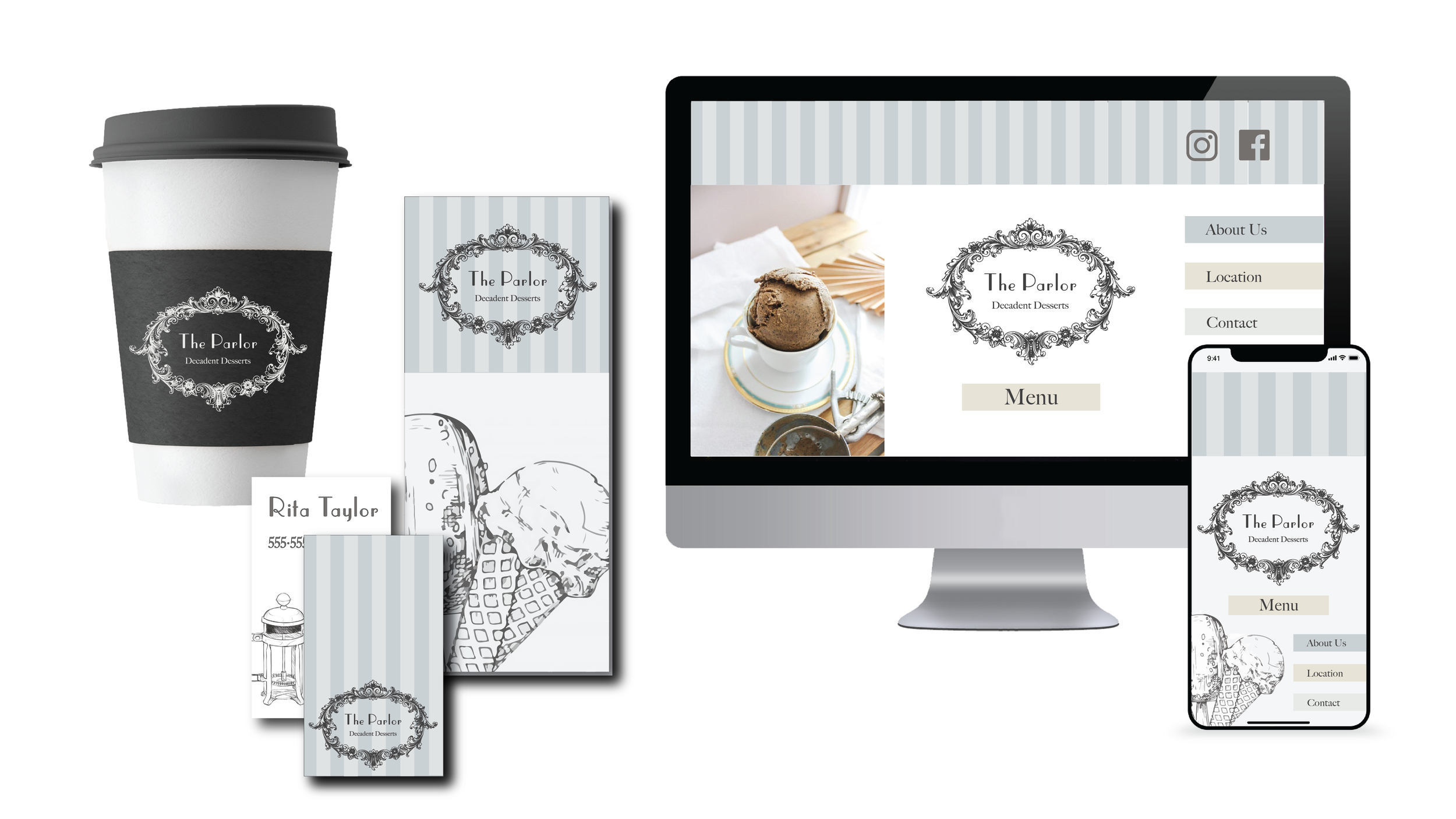
The Parlor, an ice cream and coffee shop located in Southwest Michigan, has been a favorite project of mine to work on. This case study will be updated in the future as this project is ongoing. So far, I’ve been able to work with The Parlor team to create a logo, word mark, look and feel, and color palette. The look and feel is influenced by Magnolia, a large retail company with a modern farmhouse aesthetic.
I also consult with the team to provide marketing insights related to social media, web, and other digital marketing initiatives. In addition to the initial brand foundation, I’ve also created a face for the brand, Pearl, a beautiful heifer full of love!
MOODBOARDING
MOODBOARDING
The following gallery of images shows multiple moodboards and mockups for The Parlor’s brand. The team chose a blend of Joanna’s Touch and a hint of Boxwood Dreams for the overall look and feel for the brand.


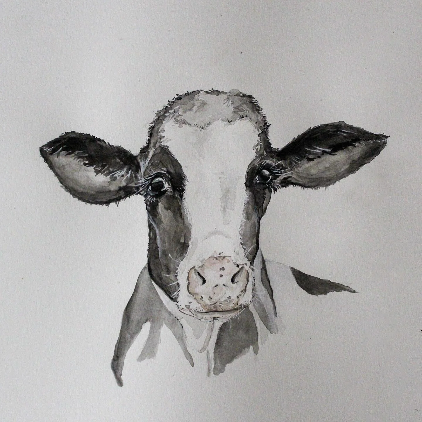
The Evolution
of Pearl
The owners of The Parlor wanted a watercolor, painterly style of a cow as the face of the brand. As a painter at heart, I was thrilled to paint Pearl! See how Pearl went from sketch, painting, to digital vector and logo format.


Looking Ahead
The Parlor is a work in progress. As time goes on, this page will be updated to show the brand identity progress, added marketing materials, and more.