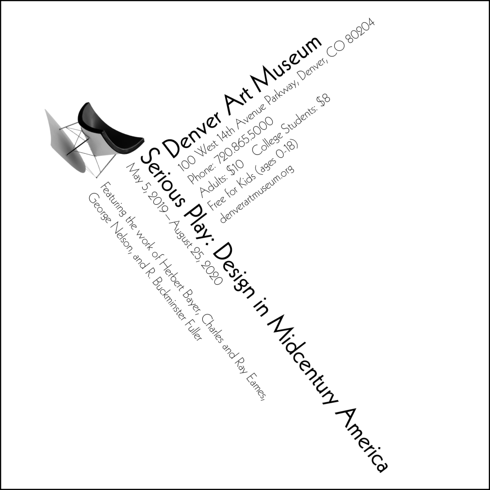
Exhibition Assignment: Typography, Layout, and Hierarchy Project
Objective: To create a square, black and white advertisement for an exhibition, “Serious Play: Design in Midcentury America.” This was for a graphic design course at Western Michigan University.
Outcome: I chose to use an angle to make the design more visually interesting, as we were limited to using up to two typefaces and designing in grayscale only. The headings are more transparent so that they do not take away from the overall copy.
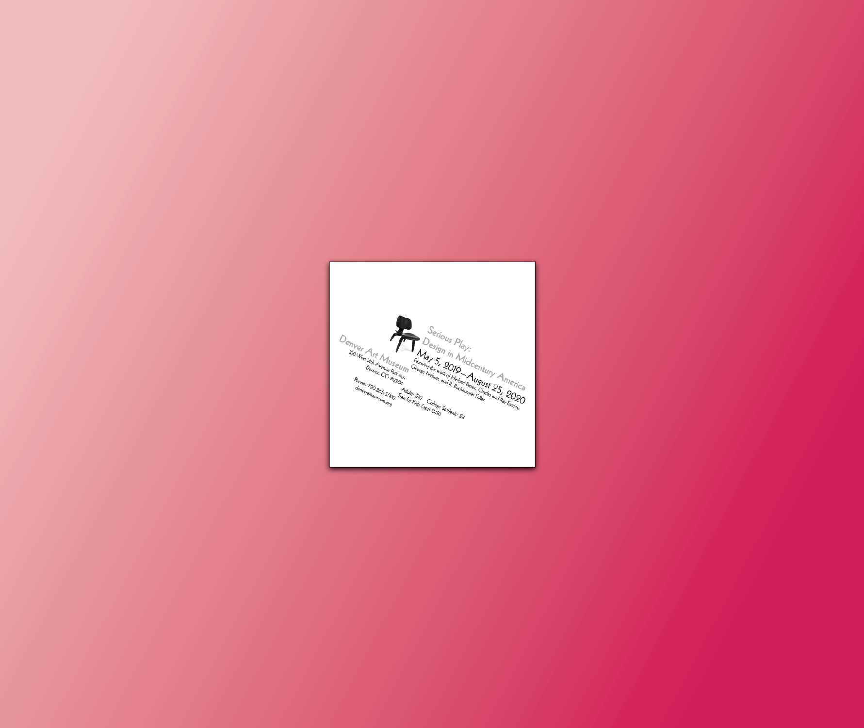
See below samples of advertisement iterations.